The exponential spread of the Ebola virus
Posted on Wed 15 October 2014 in data
Update 15 Oct 2014: is the spread of Ebola slowing, or is the data getting less accurate?
At the end of July, I posted a graph which highlighted the scary exponential growth in the number of Ebola infections in West Africa. When I updated the graph with fresh data in August and September (see below), the exponential rate of growth appeared to be ever increasing. It was a somber trend which should have set off alarm bells across governments much sooner than it did.
I updated the graph again today. Interestingly, for the first time since July, a simple exponential curve no longer appears to fit the most recent data. Is the rate of growth slowing down?
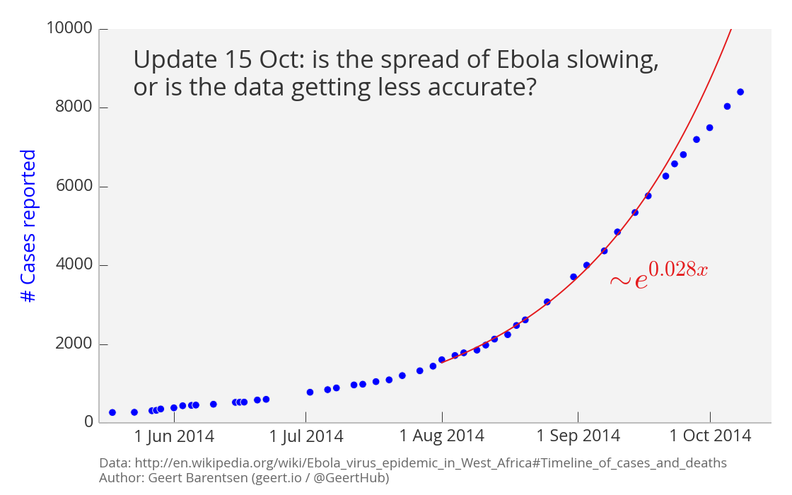
It is too early to be delighted about this apparent curving of the trend. As Lynn Magoon pointed out in the discussion thread below, the World Health Organization (WHO) believes that the apparent decrease in the number of new cases reflects the increasing problem of gathering accurate data. In their Situation Report of October 8th, the WHO wrote:
"It should be emphasized that the reported fall in the number of new cases in Liberia over the past three weeks is unlikely to be genuine. Rather, it reflects a deterioration in the ability of overwhelmed responders to record accurate epidemiological data."
As a result of this remark, the red exponential curve in the graph has been fitted using only the data from July 2nd through September 17th. Ignoring the data from the last three weeks is, in some sense, the simplest imaginable way to model the systematic underestimation of the recent numbers. Although a logistic function would offer a much better fit to the data, it would not take this extra knowledge into account.
If the exponential curve in the graph is an accurate model of the reality, then there would be 20 000 cases by the end of October, 48 000 by the end of November, and 116 000 by the end of December. Let's hope that this simple model proves to be wrong.
Update (17 Sep 2014)
Seven weeks have now passed since I posted my original graph, and the number of reported Ebola cases has continued its exponential growth. In fact an updated version of the graph, shown below, suggests that the growth rate is getting even worse. An exponential fit to the number of cases from mid-July through to mid-September suggests that their number now doubles every 24.3 days (as opposed to every 29 days previously). This may be explained by the fact that the data is now more strongly dominated by the regions where the disease is not under control however, or by improved reporting procedures, rather than being due to a change in the nature of the epidemic. I hope to examine the data in more detail in the near future to understand.
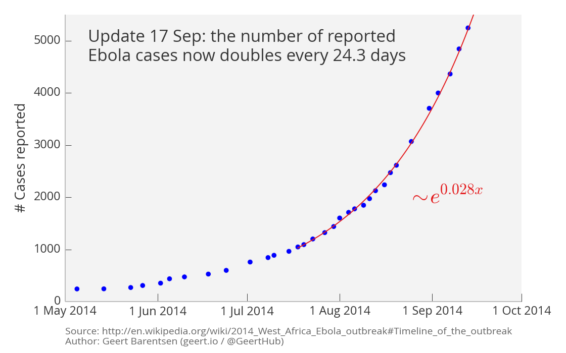
Again, the source of the data is the Wikipedia page on the outbreak, which is based on official information from the health ministries of the affected countries.
Update (21 Aug 2014)
Three weeks have passed since I posted my original graph on the exponential spread of the Ebola virus, so I am now publishing a new version which includes more recent data. The updated graph shows that Ebola has continued to spread exponentially, with no sign of slowing down yet. The regression fit suggests that, at the present rate, the number of reported cases of Ebola doubles every 29 days (ie. log[2]/0.024 = 29):
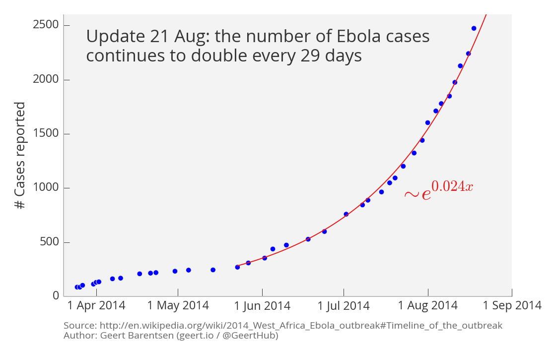
The data is taken from the Wikipedia page on the outbreak and is based on official information from the health ministries of the affected countries. According to the World Health Organization however, these numbers "vastly underestimate the magnitude of the outbreak". That is scary!
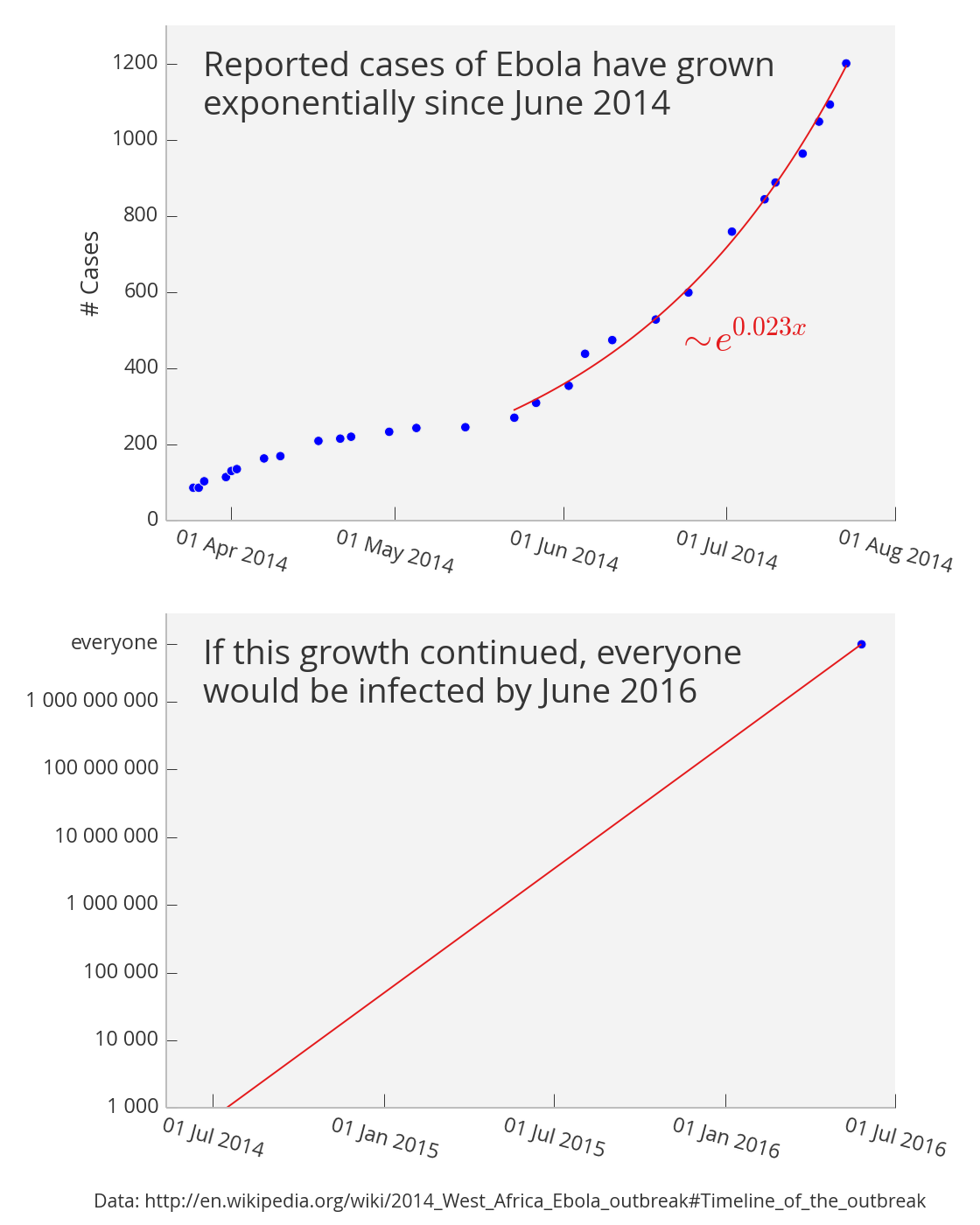
Original post (30 Jul 2014)
I made a quick plot this morning which attempts to make a point about the nature of exponential growth. Let me stress that I am of course not an epidemiologist, all I know is how to fit an exponential curve when I see one.